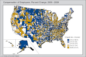
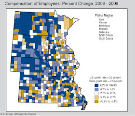
Two-thirds of our 3113 counties saw compensation go down in 2009. The map shows a familiar pattern (click image to enlarge):

The center of the country does better than the coasts. The most populous counties generally saw larger decreases in compensation (3.7%) than medium and smaller counties (2.2%–2.3%)
South Dakota looks pretty healthy, with lots of counties in the blue upper quintiles (remember, blue is good on this map, while gold shows where there's less gold). But hey, zoom in: what's that gold spot in East River South Dakota?
 Discover the Unexpected™: Lake County bucked the statewide trend and landed in the lowest national quintile for compensation growth. Statewide, average compensation per job increased 1.3%, from $32,702 to $33,136. Total compensation statewide went down 0.7%. But in Lake County, the average wage decreased 1.8%, from $28,993 to $28,466. Total compensation in Lake County dropped 6.6%.
Only four counties—McCook, Marshall, Union, and Harding—saw worse declines on total compensation. Harding lost the most compensation, dropping 15.7%, with average wages per job dropping $3200 in one year. Weep not for Union County, though: they have the highest average wage per job in the state, just over $39,000.
Great USA map!
ReplyDeleteSee where all the blue stuff falls: North Dakota and Montana -- the only two states in the whole union (if I recall correctly) that do not project budget deficits for 2012-2013.
And they both have an income tax (sigh).
Well, see where the heaviest amounts of blue precipitation fall! Plenty of it falls on the unjust as well as on the just.
ReplyDeleteStan, I want a good map app that will allow me to overlay data from any two maps to highlight correlations (or non-correlations) just like that. Snow and income? Taxes and unemployment? Map 'em! Now who can find me that map overlay program?
ReplyDelete